(This is the second of two articles on the Mixer Brush that I've written.
The first can be found here.)
The first can be found here.)
A while back I wrote an article about some of the technical shortcomings of Photoshop CS5's new Mixer Brush, and how I've managed to overcome them for the time being (link). In this article, I discuss some new practical tips for using the Mixer Brush, including how to create a mixer palette, loading multiple colors quickly by using a custom brush, simulating real-world brush sizes, and improving details and color.
1.) Create a Mixer Palette
If you use Corel Painter, you probably have noticed the inclusion of a mixer palette, which allows you to mix colors in a real-world manner before applying them to your painting. With the inclusion of a new Mixer Brush in Photoshop CS5, not including a mixer palette in CS5 seems like a huge oversight. Creating one, however, is actually a simple matter.
With Photoshop's tabbed document layout, floating windows stay visible in front of all tabbed documents (Windows PCs only). In other words, to simulate a mixer palette in Photoshop, you simply need to create a new document and then 'tear' the document tab out of the default tabbed layout, so that the new document floats in its own window.
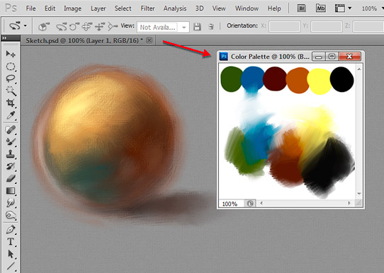
Your new 'mixer palette' will remain on top of your painting so long as your painting remains tabbed. Just resize the window to your liking, then add and mix your colors. While working on your painting, you won't need to switch documents to sample colors from your palette either - just hold the 'Alt' key and click in your 'mixer palette' to sample colors.
2.) Make a Custom Brush to Easily Load Multiple Colors
Loading multiple colors with the new Mixer Brush in CS5 often yields more realistic results, especially when laying down large fields of color. Getting the desired colors onto your brush, however, requires a little preparation, as you need to mix the colors first and then sample the image. Using a custom brush with randomized 'Color Dynamics' settings can save a lot of time by producing a multi-colored swatch from just a single color.

To create a special 'Color Palette Brush' to mix colors for you, select the default round brush preset with the regular Brush Tool, and then adjust the 'Brush Tip Shape', 'Scattering' and 'Color Dynamics' settings to something like the following:

Now you can simply pick a desired color and then use the custom brush to quickly lay down a multi-colored 'swatch', which you can then sample with the Mixer Brush. Just make sure 'Load Solid Colors Only' is turned off in the Mixer Brush Tool Options (shown in the first picture). (Note that the sample size or 'swatch' you lay down must be as large as the Mixer Brush's size in order to fully load the brush.)
To create multi-colored gradations for sampling, you can change the 'Foreground/Background Jitter' control to 'Pen Pressure' and then lay down a blend of colors using both the foreground and background color:

3.) Simulating Real-World Brush Sizes
A nice trick I learned from a forum post by John Derry is how to simulate the size of real-world brushes in Photoshop (and any other program for that matter). Basically, to simulate real-world brush sizes, you merely have to relate them to the pixel resolution of your image. So, if you're painting in a 300dpi image (a standard resolution for printing), a 300-pixel brush would equate to a 1-inch brush in the real-world (300dpi = 300 pixels per inch). Likewise, a 150-pixel brush would be a 1-inch brush in a 150dpi image (an acceptable resolution for inkjet printing).
Considering that the Mixer Brush is meant to simulate real-world paint blending, you might find it more comfortable working with brush sizes you're familiar with.
4.) Start Small
Unless you have a state-of-the-art computer, you've probably noticed that Photoshop's new Mixer Brush requires considerable processing power. To make matters worse, when combined with Photoshop's new Bristle Brushes, the Mixer Brush can bring your computer right down to it's knees. For this reason, I recommend starting small (150dpi or less) before finishing your painting at a higher resolution.
Working at a lower resolution will allow you to block in large areas with big brushes without experiencing too much of a performance hit. And you can simply increase the resolution of your image as you begin to refine and add details.
I find that 150dpi works for my particular system. If I need more detail, I bump the resolution up to 300dpi.
5.) Sharpen to Improve Details
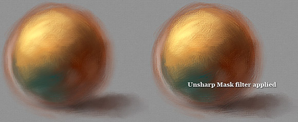
Painting in Photoshop sometimes results in a 'soft' painting, especially when using the Mixer Brush. Details end up blurry, and brush strokes lose their definition. To help bring back detail and make the image 'pop', I often use the 'Unsharp Mask' filter (a staple for photographers).
Found in the 'Filter>Sharpen' menu, 'Unsharp Mask' enhances details by increasing contrast along edges it finds in the image. The size of the edges found is determined by the 'Radius' setting. Basically, to enhance textures and small details, use a low radius setting. To enhance the contrast of large features, use a higher radius setting. The 'Amount' controls the amount of sharpening applied. 'Threshold' helps protect smoother areas from being sharpened (like skin texture) when you only want edges to be sharpened.
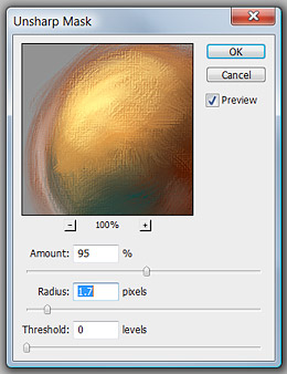
Generally, you'll only want to use radius values between '0.5' and '2' depending on the resolution of your image. For paintings, I rarely ever use a threshold setting higher than '0' because I want textures and brush strokes to be enhanced as well as details.
(If you want to selectively apply an 'Unsharp Mask' to certain areas of your painting, you can duplicate the painting onto a new layer, then sharpen and apply a Layer Mask to the duplicate. Paint out the Layer Mask with white to selectively sharpen areas by revealing the sharpened duplicate.)
6.) Pump Up the Colors
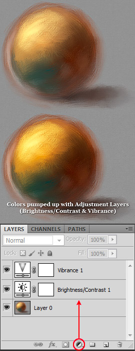
Mixing colors in any medium can sometimes result in a muddy painting. And mixing colors with Photoshop's new Mixer Brush is no exception. Thankfully, adjusting colors in Photoshop is a snap using Photoshop's many Adjustment Layers.
Some of the most useful Adjustment Layers for painting include Levels, Curves, Hue/Saturation, Color Balance, Brightness/Contrast, and Vibrance. For the sake of this article, however, I'll only discuss the Brightness/Contrast and Vibrance adjustment layers, since both have been improved in recent versions of Photoshop and now represent the easiest way to enrich the colors of an image.
In older versions of Photoshop, using the Brightness/Contrast adjustment layer was generally frowned upon because it clipped colors, unlike the more advanced Curves adjustment layer. This problem has been fixed in recent versions of Photoshop, and Brightness/Contrast now provides a quick and easy way to punch up the contrast in an image, enriching colors slightly in the process.
Similarly, the Vibrance adjustment layer was added to Photoshop to address the problems of color clipping caused by the Hue/Saturation adjustment layer. The new Vibrance slider increases color saturation with minimal color clipping and now provides perhaps the best way to increase color saturation in an image.
Combined, the Brightness/Contrast and Vibrance adjustment layers represent a quick and easy way to pump up colors which may have gone muddy while painting with Photoshop's new Mixer Brush.
Conclusion:
In summary, this is the summary. ;-P Who needs conclusions anyway if you read the article?
Thanks for reading! =)
Hi Geoff:
ReplyDeleteAnother great post! I was really jazzed about the floating mixing palette only to discover that this is true on Windows systems only. On OS X, clicking on an image window brings it to the front, hiding other windows.
Now I've got a case of Windows envy!
-john
@John Derry,
ReplyDeleteThanks, John! That's too bad, but thanks for letting me know -- I'll make a note of it!
Geoff,
ReplyDeleteI've been working with the Mixer Brush for a month or so now. My own interest in to use it in the photo sampling mode - via the "Sample All Layers" option. Some folks refer to this as cloning, but that's really a mis-definition. Anyways I wondered if you have any experience to share on that front (?) (The insights and info you've written on concerning configuration and performance issues are very helpful. Many thanks.)
John Stevenson
@jstvnsn,
ReplyDeleteHi, John! All I can really recommend for 'Sample All Layers' is not to use it unless you have to (or unless you have a fast machine) as it slows down performance.
In the first article I wrote, I mention how you can use Copy/Paste Merged to simply duplicate underlying layers so that you can paint on a duplicate. Using 'Sample All Layers' on an empty layer merely saves you disk space.
Geoff,
ReplyDeleteThanks. I agree with you that "Sample All Layers" is often only practical in a 'sample-just-one-layer' situation. But that is OK anyways in the photo sampling case. Just to mention - in that specific context - that: (a) there's no real benefit in using 16-bit images over the 8-bit version (and performance improves as a consequence), (b) that "standard" brushes are often a good choice (as compared to their Bristle Tip brethren, and, (c) that the "Sample All Layers" feature isn't new to CS5 (it provides the same function as has been a part of the Smudge tool for a while ...).
John
@jstvnsn,
ReplyDeleteGood points, John! Thanks!
Hi Geoff! I've only just found your last two pieces on the new Mixer Brushes, but I must say that I got a lot out of them, so a big thanks!
ReplyDeleteIt's a pity about palette and mac, I have a mac! :-)
Well I look forward to hearing more from you...
All the best!
DickyMac
This is very helpful. Thanks for sharing, this makes mixing much easier to figure out. :)
ReplyDeletecheers!
ReplyDelete